
7°C 
51
Powietrze
Jakość powietrza jest średnia.
PM1: 20.08
PM25: 31.11 (207,39%)
PM10: 39.92 (88,71%)
Temperatura: 6.70°C
Ciśnienie: 1024.42 hPa
Wilgotność: 72.33%
Dane z 04.10.2026 05:55, airly.eu
Szczegółowe dane meteoroliczne z Mińska Maz. są dostępne na stacjameteommz.pl
Szczegółowe dane meteoroliczne z Mińska Maz. są dostępne na stacjameteommz.pl

Zaloguj

facebook
REKLAMA








Forum
Microscopy images
 2 postów
 Postów: 3

Hi everyone! I have some decent microscopy images for an upcoming presentation, but the raw files look a bit grainy and dark. Does anyone have tips on how to properly clean up and adjust these images without violating any journal data-alteration policies?
Postów: 2
That is a very delicate line to walk, as journals are incredibly strict about image manipulation. You should only ever adjust the brightness and contrast globally across the entire image, never locally. If your raw data is still hard to interpret visually, sometimes it is better to pair it with a schematic drawing. I actually got this idea after seeing how Ella Maru Studio https://scientific-illustrations.com/ balances raw data with artwork. They create clear scientific images and animations that can accompany your experimental data to show exactly what the viewer should be looking at. Placing a beautiful 3D schematic right next to your grainy microscopy slide helps the audience understand the structure instantly while keeping your original data completely untouched and honest.
Zaloguj się aby uczestniczyć w dyskusji oraz uzyskać dostęp do większej ilości wątków na tym forum.
Aktualności
 14.09.202608.07.202624.06.202622.06.202603.09.2026
Zobacz również
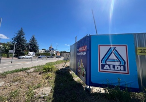
ALDI powstaje w Mińsku Mazowieckim
25.06.2026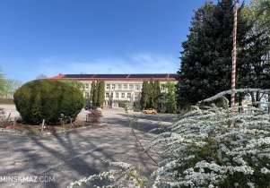
173 wolne miejsca w szkołach Powiatu Mińskiego
23.07.2026
Odjazdowy Bibliotekarz po raz dwunasty
23.06.2026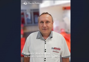
Próba oszustwa udaremniona dzięki pracownikom poczty
01.07.2026
Projekt Erasmus Plus w Szkole Podstawowej nr 3
06.08.2026
Katyński Dąb Pamięci zasadzono przy liceum na Pięknej
21.06.2026